

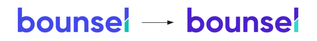
At Bounsel we are renewing our image. An update of our brand according to this new stage that we started with a main challenge: to transmit and communicate our values in a simple, clear and direct way.
The aim is to show the potential of our platform and the possibilities it offers to simplify contractual processes and make life easier for companies in document management. These values of “power”, “control”, “simplicity”, “tranquillity”, etc… are what make up the brand, and therefore need to be represented in the logo.
This redesign could be defined as a “facelift” of the brand, as Bounsel has achieved a certain presence in the business sector both nationally and internationally, and for this reason, we did not want to carry out a radical visual change that would cause a dissociation between the brand and its updated logo.
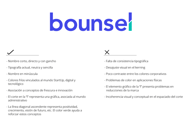
The first step in this process was the graphic analysis of the current logo, by which we obtained its strengths and the elements that could be improved.
Once the analysis is done, we start with the redesign phase. We slightly increased the thickness of the typography of the name to give it a better unification and greater presence.
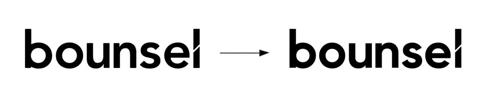
Along with this change in the text, we made a correction in the kerning (spacing between characters) to improve its visualisation and coherence.
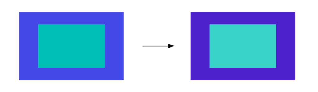
As for the chromaticism, we made some adjustments to the shades of the corporate colours in order to solve the lack of contrast between them, which was causing difficulties in the visualisation of the corresponding versions, especially in cases where the two colours were superimposed. This increased contrast has also helped to create a greater visual impact in the colour versions of the logo.
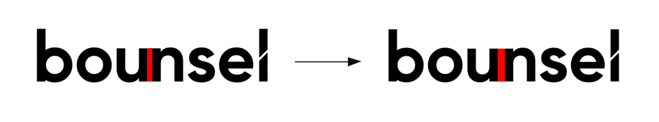
In the composition, the letter “l” presents an intervention in the form of a cut representing an ascending graph as a reference to the more analytical approach we want to link to contract management. This element has also undergone a slight variation.
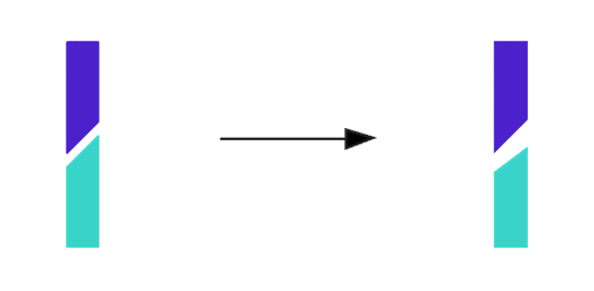
As can be seen in the image, we have enlarged the cut and modified the inclination of the edges, so that the parallelism between them is lost. These changes will achieve the following:
- Better tolerance to downsizing. With the previous logo, because the cut-out space was so narrow, the logo was not properly visible in cases where the mark was applied in very small dimensions. With this redesign, the two parts that make up the Bounsel letter “l” can be properly differentiated in small brand sizes.
- More openness, more “air” and less feeling of “crampedness”. One of our core values is “peace of mind”. Our platform offers a secure and intuitive experience, so it is essential for us that our users feel that peace of mind when managing their documentation on Bounsel. By changing the width of the cut, we are able to represent this important concept in a visual way.
- Identification with the concepts of “expansion” and “growth”. As a startup, we aspire to continue to grow and establish ourselves in a constantly changing market. Expressing this forward-looking vision helps to establish us as a brand with a long-term vision, which builds trust with our customers.
- More groundbreaking design linked to the concept of “innovation”. In updating the logo, we have eliminated the parallelism between the two parts of the letter “l” and replaced it with an asymmetrical cut; this modification gives the brand a strong and innovative character, less systematic and “breaking with the established”.
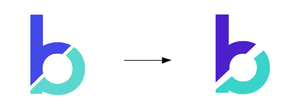
Next to the official Bounsel logo we have the favorites icon, a secondary graphic element used in cases where the brand has to be applied in small spaces or as an icon for profile images on social networks, website, etc.
We have also renewed the favorites icon design following the same technical and aesthetic guidelines used for the logo. Through the same creative process, we have updated this element, which shares graphic similarities with the letter “l” in the Bounsel logo. The typographic weight, the corporate colours and the cut between the two parts of the “b” have been modified, so that it connects with the new visual style present in the logo.
With this update of our corporate image, the aim is to communicate in a coherent and honest way the kind of brand we are and the product we offer. It is very important for us to express our commitment to help companies with document management through our smart contract management platform and, at the same time, to convey the values that define us as a brand and as a startup.
We believe that the essence of a company’s identity should be captured in the logo. That is why, as we begin this year with new challenges and objectives to meet, we think it is the right time to give our corporate image a facelift and achieve that nexus between everything we want to communicate.
Do you want to know a little more about us? here we tell you all about us, don’t miss it!
